Reception Desk or Self-Service Point? Choosing a First Stop
Reception desk or self-service point? Learn which first stop suits routine requests, uncertain needs and situations where a person’s judgement matters.
The common mistake is choosing a first stop by how quickly it can process a routine request. A reception desk or self-service point must also cope with people who are unsure what they need, need help communicating, or arrive with a question that does not fit a standard option. If the first stop cannot recognise those situations, a quick entry can become a frustrating detour.
Reception desk or self-service point
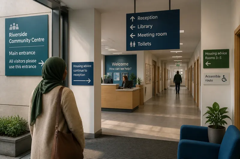
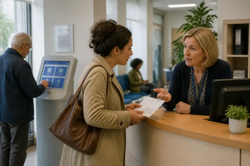
A reception desk puts a person at the start of the service. Staff can listen, ask a follow-up question and decide whether to answer directly, refer someone elsewhere or bring in a colleague. This is useful when requests vary, when a visitor may not know the service’s internal names, or when a brief exchange can prevent an avoidable hand-off.
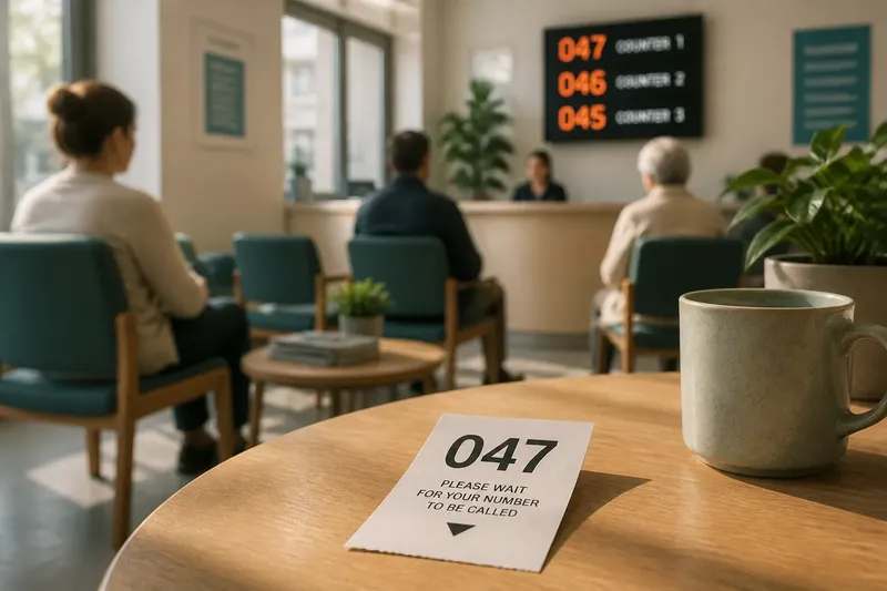
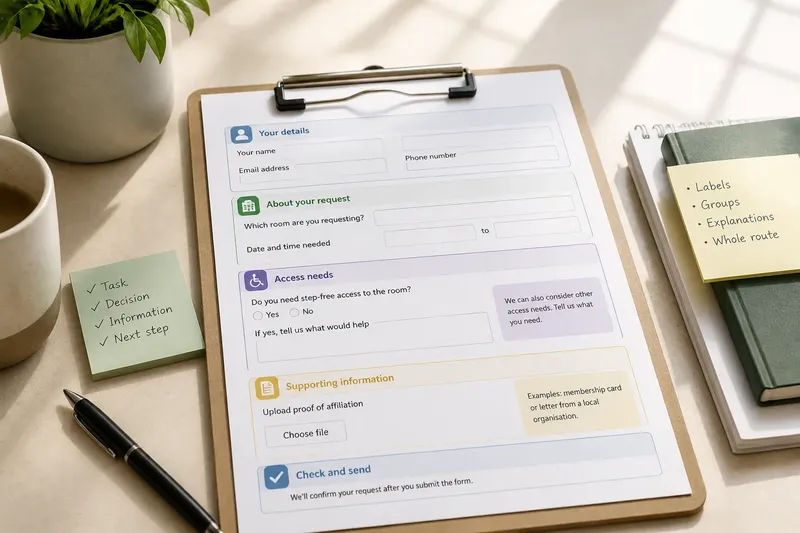
A self-service point asks a visitor to make an initial selection without a staff member. It might be a tablet, a touchscreen kiosk, a paper form station or a public computer with a sign-in page. Self-service can suit a clear, repeatable task: checking in for a booked appointment, taking a numbered ticket or finding a standard document.
The distinction is not simply “human” versus “digital”. A desk can still direct visitors to a form, and a screen can be designed to summon staff when someone needs help. The practical question is what each first stop can recognise and do, and what happens when the request is unusual.
Routine tasks suit prompts
Self-service works best when the visitor can identify the task from the choices shown, complete it without explaining personal circumstances, and see what to do next. A clear prompt can be easier than waiting to ask a question whose answer is already standard.
Consider a leisure centre where visitors arrive for a booked class. If the screen offers a distinct check-in option, confirms that the visit has been recorded and points out where to wait, it can handle that familiar transaction. The prompt should not imply that the machine can answer questions about an unfamiliar class, a booking discrepancy or a change in access needs.
Routine does not mean effortless for everyone. A person may be unfamiliar with touchscreens, have limited dexterity, need more time to read, or prefer not to enter personal details in a public area. A service should consider whether the same task can be completed with staff assistance and whether the screen is placed and worded so a visitor can use it privately and comfortably.
A self-service point also needs a clear route out of the transaction. If someone chooses the wrong option, cannot read the screen, or reaches a page that does not match their situation, there should be a visible way to ask for help. Otherwise, the interface can make a simple task feel like a test the visitor has failed.
Unclear questions need judgement
Many first enquiries are not ready-made requests. Someone may say they have received a letter they do not understand, need to speak to “the right person”, or are unsure whether a shared building provides the service they need. A receptionist can notice the uncertainty and ask a plain follow-up question rather than expecting the visitor to choose a department name.
That judgement has limits. Reception staff may not be qualified to advise on every subject, and a desk should not imply that they can resolve specialist, confidential or urgent matters themselves. A useful role is to identify the broad need, explain the next step and make a suitable hand-off where possible.
A self-service menu can handle some ambiguity if it offers human-readable choices and an “I’m not sure” route. That option should lead somewhere useful: perhaps a staffed desk, a call point or a short explanation of how to request assistance. A button that merely returns the visitor to the start does not solve uncertainty; it hides it in the interface.
Imagine a visitor at a neighbourhood service centre holding a letter about a meeting but not knowing which team sent it. A kiosk offers only “housing”, “benefits” and “appointments”, and the visitor is unsure which applies. If the screen provides a clear option to speak to reception, staff can inspect the letter’s sender and direct the visitor without asking them to diagnose the service first.
Support should match the task
The useful comparison is not which arrangement looks more modern. It is whether the first stop can offer the kind of assistance the task requires. Staff can clarify language, respond to a visible difficulty and adapt a conversation. A self-service point can give consistent prompts, support a private choice where designed well, and let a person complete a known task at their own pace.
Neither arrangement is automatically private. A conversation at an open desk may be overheard; a screen may expose information to people standing nearby. Services handling sensitive enquiries need to consider the space as well as the interface. A receptionist might offer a quieter place to talk, while a kiosk can avoid displaying unnecessary personal information in a public queue.
Accessibility also involves more than whether a device has a large screen or a desk has a low counter. Consider the whole interaction: reaching the first stop, understanding the choices, entering information, hearing or seeing confirmation, and getting help if the process breaks down. Where visitors use different languages or communication methods, a staffed route can offer flexibility; a digital route can support alternatives such as text or audio only if those options are actually available and understandable.
Think of a first stop like the front pocket of a bag: it is helpful for things that belong there, but it cannot hold every item someone brings. A service needs a way to recognise when a request does not fit the first pocket and move it to the right place without blaming the visitor.
Design the hand-off
The transition between self-service and staff is part of the service, not a backup detail. A visitor should not have to repeat a long explanation simply because the first step was completed on a screen. Where appropriate, the interface can produce a ticket or short confirmation that helps staff understand the request without exposing more information than needed.
Likewise, a staffed desk may direct someone to a machine for a suitable task. The hand-off should include a reason and a clear next action, rather than a vague instruction to “use the kiosk”. A small amount of explanation helps the visitor understand why the route fits and what to expect there.
Services can observe the points where hand-offs falter without treating every pause as a failure. Do visitors repeatedly return to the desk after selecting a screen option? Do staff often need to explain the same choice? Do people abandon a form midway? These visible signals can help identify confusing routes. They should prompt a closer look at the wording, placement or support available, not an assumption that visitors are careless.
For any particular service, the appropriate arrangement can depend on the task, the information collected and the setting. Follow the service provider’s instructions and applicable local requirements where they govern access or handling of personal information.
Choosing the first stop?
When is a reception desk the better choice?
A desk is better suited to enquiries with unclear wording, unexpected circumstances or a need for a person to interpret what the visitor is asking. It can also help when a request needs a careful referral rather than a standard transaction.
When does self-service work well?
It works well for a familiar task with a small number of clear choices and an understandable confirmation. Visitors also need a practical route to staff if the task does not match their situation.
Can a service use both?
Yes. A service can use self-service for straightforward arrivals and keep reception available for questions, assistance and exceptions. The two routes should be visibly connected, so choosing one does not make the other feel inaccessible.
What should a visitor do if unsure?
Choose the route that makes it easiest to ask for clarification, rather than guessing at a department or entering information that does not seem relevant. If a screen offers no suitable option, look for a staff contact or ask at reception before continuing.
Make the route legible
When choosing between a reception desk and a self-service point, start with the questions visitors actually bring, not the ideal task imagined by the service. A reliable first stop lets people complete a clear request independently while making uncertainty visible and answerable. That balance helps staff spend attention where judgement matters, without turning routine access into a conversation that nobody needed.
The most useful design detail may be a modest one: tell visitors what the first stop can do, and show how to reach another kind of help. When that boundary is clear, people can choose a suitable route without having to understand the organisation behind it.