A Sign Is Part of the Service: What Good Wayfinding Does
Good wayfinding signs help visitors anticipate each next step, reducing uncertainty from the entrance to the right service point without relying on staff.
The most common wayfinding mistake is to put a clear sign above the destination and assume the journey is clear. A visitor may still be left guessing at the entrance, at a fork in the corridor or just before a door. Good wayfinding signs reduce that uncertainty by showing what comes next, not merely naming where the service is.
Imagine a hypothetical visit to a council-run community centre where a resident, Amina, has an appointment at the housing advice service. She has never been inside. The centre also contains a library, a meeting room, public toilets and a reception point, all reached from the same entrance. The wayfinding problem is not simply finding the housing service; it is helping her understand the route as it unfolds.
Before the entrance
Amina first needs to recognise that she has arrived at the right building and understand where visitors enter. A sign that says “Housing advice” but is hidden behind a noticeboard does little at this stage. A visible entrance sign should name the centre in terms visitors are likely to recognise and make the public entrance distinguishable from staff or delivery doors.
This first sign can also set expectations. If visitors should go to reception before proceeding, say so plainly. If appointments are accessed directly from a particular entrance, identify that route instead. The purpose is not to explain every service outside; it is to prevent an avoidable pause at the threshold, where a newcomer has little context for interpreting the building.
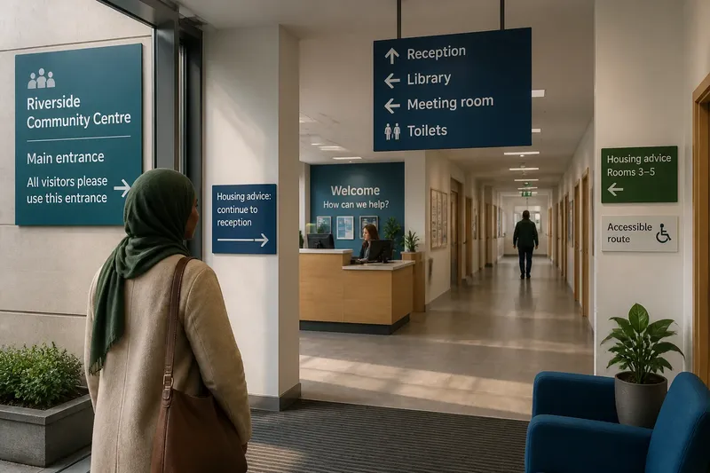
In Amina’s case, the entrance sign names the community centre and directs visitors to the main entrance. A smaller notice inside the vestibule says, “Housing advice: continue to reception.” She now knows both that she is in the right place and what her first action should be.
The first decision
Inside, Amina reaches a lobby with a reception desk ahead and a corridor to the left. The corridor has several doors, but no sign at its opening. A destination sign on the housing office door would be accurate yet insufficient: Amina cannot see that door, and the corridor offers no reason to choose it.
A sign at the lobby junction resolves the decision before she has to make it. It points to reception and names the other destinations available in that direction, such as the library and toilets. The layout of the sign should make the direction and the destination read as one piece of information. A list of room names without directional cues leaves the visitor to work out which item applies.
Sign placement matters because people look for guidance where a choice becomes visible. A sign placed after the junction may confirm that Amina has taken a route, but it cannot help her choose it. Think of signs like stepping stones across a stream: each one should be visible from the point where the next step is uncertain.
A route that confirms itself
At reception, Amina checks in. The receptionist tells her to take the left-hand corridor and wait outside Room 4. That spoken instruction is useful, but a consistent sign should support it rather than introduce a different name or route. If staff say “housing advice” while signs say “community support”, a visitor may reasonably wonder whether they refer to the same service.
On the corridor sign, “Housing advice” appears with an arrow to the left. Amina follows it and reaches a junction with two similar-looking passages. Here, the sign needs to distinguish the next turn, not repeat a general message that was useful only at the entrance. It points towards “Housing advice, Rooms 3–5” and includes the left arrow. A further sign near the rooms identifies Room 4.
The sequence offers reassurance at three different moments: where to begin, which corridor to take, and which room to approach. The signs do not need to repeat every detail at every point. They do need to maintain a recognisable service name and give enough confirmation that a visitor can tell whether the chosen route still makes sense.
Words, arrows and surroundings
Good wayfinding combines wording with visible context. Amina can compare the sign’s arrow with the corridor opening it refers to. If an arrow points vaguely towards a broad wall or appears centred between two routes, its meaning is uncertain even if the service name is clear. Arrows should relate plainly to the decision in front of the visitor.
Names should also be consistent across signs, appointment messages and staff instructions wherever practical. This does not mean that every sign must repeat a full explanation. It means that a visitor should not have to translate between a formal department name, a local nickname and a room label while walking through an unfamiliar building.
Contrast and legibility affect whether information can be read in the conditions where it is used. A sign may be easy to read in a quiet corridor and hard to pick out beside a bright window, a busy noticeboard or a reflective glass door. Designers can consider the viewing angle, lighting, background and the distance from which a decision is made. A sign crowded with several competing notices may be present but functionally lost.
Some visitors may use mobility aids, have limited vision or find unfamiliar buildings difficult to interpret. Clear, uncluttered wording and a route that does not depend only on colour can make the signs more usable. Where a route includes stairs, a lift or an accessible alternative, the information should help visitors identify the relevant option before they reach a point where turning back is awkward.
Where does a sign belong?
Should every room have a sign?
Not every door needs a large sign, but rooms that visitors must identify should be labelled in a consistent, visible place. A room number is most helpful when visitors have already been given that number and the route signs lead them to the correct area.
When should a sign appear?
Place guidance at or just before a decision, where the visitor can still choose the route. A confirmation sign after a turn can help, but it cannot replace the sign that should have made the turn understandable.
Can colours replace words?
Colour can support recognition, such as marking a service zone, but it should not carry the meaning alone. Visitors need a readable name and a clear directional cue even if they do not distinguish the colours as intended.
What if the route changes?
Temporary diversions should use the same service names and a clear sequence of directions as the permanent signs. A single notice at the blocked doorway may explain the obstruction but leave visitors uncertain about the alternative route.
When the route breaks
Suppose Amina reaches the corridor and finds it closed for maintenance. A notice on the barrier says, “Use alternative route”, but does not indicate where that route begins. The instruction names a problem without helping her act. A more useful diversion sign points towards the alternative at the barrier, then provides confirmation at the next junction and near the destination.
Temporary signs should be legible, secure and positioned where they can be seen without obstructing the path. Their wording should avoid creating a second naming system: “Housing advice” should not suddenly become “Residents’ support” on the diversion. If a service has moved, signs at the old location should direct visitors onwards rather than leave them to infer that the service has disappeared.
Building rules, access arrangements and the suitability of temporary fixtures can depend on the venue and local requirements, so staff should follow the relevant guidance rather than improvise changes to a route.
What the visit reveals
In the imagined visit, Amina reaches Room 4 without needing to ask where to turn. The improvement does not come from one especially detailed sign. It comes from a sequence that answers the question she is likely to have at each point: Am I at the right entrance? Where do I begin? Which way now? Have I reached the right room?
That sequence also helps staff. When signs and spoken directions agree, staff can spend less time repeating basic route instructions and more time helping with the service itself. When visitors do ask for help, their questions can reveal a specific gap: perhaps the entrance is unclear, the junction sign is missing or the room label is hard to see. The useful response is to examine that decision point, not simply add another notice somewhere nearby.
For a public building, good wayfinding is therefore part of the service people experience before they meet the person providing it. Signs that anticipate the next step can make a first visit more understandable and less dependent on confidence or local knowledge. When reviewing wayfinding signs, follow the visitor’s route in order and ask what they need to know at each decision; that is where the next useful sign belongs.